2026’s Color Mood: What’s Driving the Palette
Color isn’t just aesthetic it’s a mirror. And in 2026, the reflection is layered: recovery, rebellion, optimism, and overstimulation all show up in the shades we’re wearing and seeing everywhere. The world continues to ride waves of uncertainty economic shifts, AI disruption, ongoing climate anxiety so it’s no surprise that color trends are swinging between calm and chaos.
Tech continues to play a starring role. As virtual spaces evolve, digital first colors like soothing purples and hyper brights signal our immersion in augmented lives. Meanwhile, the rise of slow living and wellness culture pushes a return to grounded, tactile hues. Think: muddy greens, dense blues, and warm neutrals that feel like exhaling.
Mood driven design is no trend it’s a core strategy now. From UI to interiors to capsule wardrobes, color is being used to tap into emotional states: trust, calm, joy, rebellion. Brands are taking cues from emotional resonance research, understanding that visual impact starts with how something makes people feel at first glance.
You don’t have to guess what’s next Pantone and WGSN have already made the calls. Digital Lavender (a soft tech adjacent purple) and shades like Solar Orange and Acid Green don’t just appear they’re forecasted. These trend authorities blend data, culture, and psychology to project where the mood is headed, and in 2026, they’re riding the spectrum hard.
Bottom line: the palette of 2026 is emotional, reactive, and intentional. Color is no longer background it’s strategy.
The Hottest Shades of 2026
The color map for 2026 is anything but soft spoken. Leading the pack is Digital Lavender a gentle, slightly futuristic hue that’s planted itself deep into the lifestyle sector. Think calming, screen friendly tones that don’t scream for attention but still pull you in. From wellness apps to minimalist home décor, this shade is speaking the language of quiet clarity.
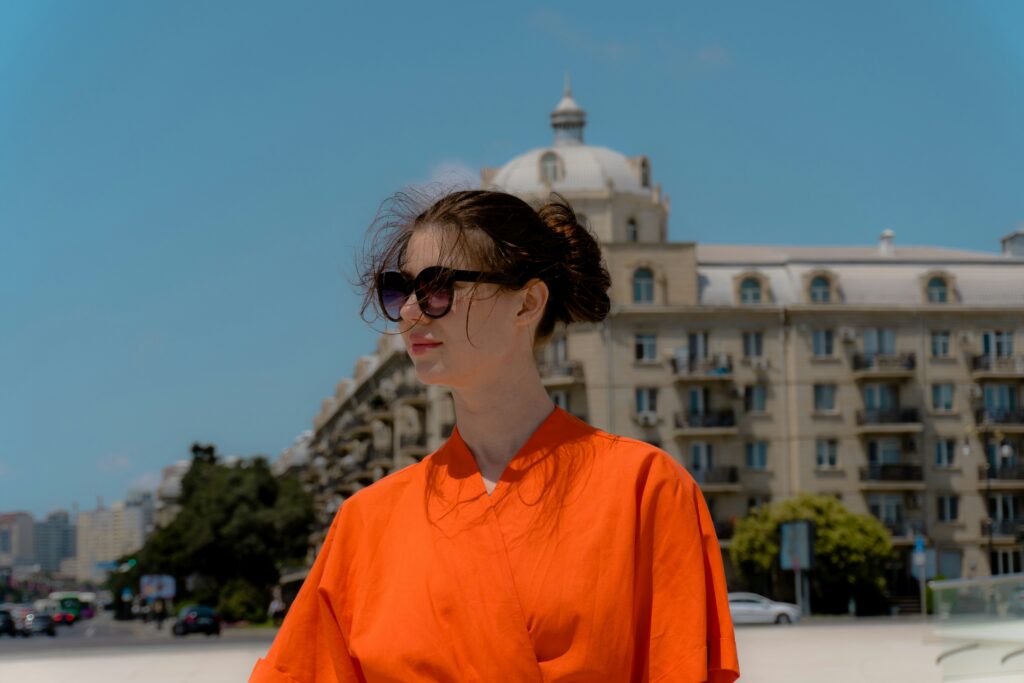
Then there’s Solar Orange, and it’s not here to be quiet. Bright, punchy, and impossible to ignore, this color is lighting up sportswear, active fashion, and even sneaker drops. It’s optimistic without being naive less sunset, more sunrise energy. Perfect for brands and creators aiming to feel alive and in motion.
Petrol Blue keeps things grounded. It’s deep without being moody and versatile enough to hold its own in fluid silhouettes across genders. It’s that middle ground between understated and confident ideal for smart tailoring, elevated basics, and outerwear that doesn’t try too hard.
And finally, Acid Green. No subtlety here. This is the loud color of choice for Gen Z, and it’s popping up in everything from nails to nylon. It’s bold, almost chaotic, and that’s exactly the point. For creators and designers focused on rebellion, reinvention, or just pure visibility this is the color to beat.
Neutrals Are Back But Not Boring
Once considered background players, neutrals have taken center stage again but with a modern twist. The 2026 wave of neutral colors is about presence, not passivity.
The New Neutrals
Today’s neutrals are richer, warmer, and more versatile than ever before. No longer just beige or white, they tell a nuanced color story that’s both timeless and contemporary.
Classic Stone: A soft gray beige hybrid that pairs beautifully with pastels or bold hues
Warm Beige: Earthy and elegant, perfect for tonal layering or interior grounding
Sand and Clay Tones: Rooted in nature, these offer calm, understated luxury
The Metallic Upgrade
Designers are amplifying neutrals with unexpected finishes. Think shimmer, luster, and sheen where you least expect it. This adds dimension without overwhelming the primary palette.
Pewter: A subtle alternative to silver, often used in accessories or hardware
Rose Gold: Still going strong, particularly in beauty and tech packaging
Oily Chrome: Futuristic, iridescent, and beginning to show up in streetwear details and home accents
Soft Shades, Strong Statements
Gender fluidity is a major influence on the emerging color spectrum for 2026. Neutral palettes now reflect softness, flexibility, and non binary expression colors designed without hard edges or gender specific associations.
Expect more crossover in fashion collections
Inclusive tones are becoming the norm across industry verticals
See more: The Rise of Gender Neutral Fashion: What’s Hot Right Now
This isn’t about playing it safe it’s about reinterpreting simplicity with range, personality, and purpose.
Where These Colors Are Showing Up
On the runways, chaos is coordinated. Designers are ditching the idea of a single standout hue and going all in on blended palettes. Think acid green bleeding into digital lavender or petrol blue underscoring a warm beige base. Monochrome still has its place, but it’s no longer the point. This year’s fashion week recaps tell a clear story: movement, mixture, and mood are what matter.
Interior design is picking up the same energy and dialing it up to eleven. Bold wall colors are back, but it’s not your grandmother’s accent wall. Picture mustard colliding with charcoal, or a sorbet pink slamming up against a deep olive. Traditional room by room uniformity is done. What’s in? Contrast, disruption, and personal expression.
Meanwhile, branding teams are finally waking up to the power of color as identity. Tech companies and wellness brands two sectors that usually play it safe are stepping out of the grayscale. Solar orange shows up in health app interfaces. Muted pastels take over product packaging in the AI space. These aren’t random choices. Brands are choosing palettes the way musicians select setlists: with intention, and for impact.
How to Use These Trends (Without Going Overboard)
Color trends may change every year, but using them effectively requires balance. It’s not about overhauling your entire wardrobe or workspace rather, it’s about knowing where and how to introduce pop and presence.
Add Strategic Splashes to Your Wardrobe
Sometimes, a single standout piece is all it takes to make a statement. You don’t need to dress monochrome in Digital Lavender but a hint of it can modernize your look.
Incorporate trending hues in small doses (e.g., bags, jackets, or footwear)
Use bright colors as accents against neutral staples
Try one statement piece per outfit to keep it wearable and intentional
Accessorize Where Color Can Carry the Look
Accessories are an easy entry point into bold color play. They’re low commitment but high impact.
Experiment with Solar Orange in athletic shoes or tech gear
Opt for unexpected touches like Acid Green earrings or a Petrol Blue belt
Layer metallic neutrals think rose gold or pewter for understated depth
Mix Trending with Timeless for Longevity
The secret to trend adoption is sustainability in style and practice. Mixing classic foundations with seasonal updates ensures that your look feels fresh without being disposable.
Pair Acid Green with black and white basics for a retro futuristic vibe
Ground bold shades with earthy, understated tones (like olive, taupe, or cream)
Invest in quality neutrals that complement shifts in trend colors, season after season
Use color to experiment, not to overwhelm. The most striking looks in 2026 will be ones that reflect thoughtful harmony not a flash of every trend at once.
Final Note: Why Color Matters More Than Ever
Color as Emotional Guidance
We live in a time of near constant input endless scrolling, always on alerts, and a culture of overstimulation. In this environment, color has become more than just a visual element; it’s an emotional compass. Whether it’s the soothing pull of lavender or the energizing jolt of acid green, the hues we surround ourselves with help us filter through chaos and reconnect with a sense of balance.
Color choices reflect our psychological needs
Consumers are increasingly drawn to comfort, clarity, or boldness through tone
Emotional relevance is becoming a key metric for design success
More Than Fashion A Full Color Experience
In 2026, understanding color goes beyond seasonal fashion trends. It’s about how those colors integrate into our everyday lives through interiors, personal tech, and even branding. Trends are no longer fleeting; they’re felt.
Color turns into a lifestyle cue rather than just a style statement
Emotional resonance defines what ‘relevant’ looks like across industries
From what you wear to what you buy, color adds meaning to utility
This year’s palette proves one thing loud and clear: relevance in 2026 isn’t just about staying trendy it’s about tapping into how color makes us feel, respond, and connect with the world around us.
 Ask Mildred Masonystar how they got into style tips and advice and you'll probably get a longer answer than you expected. The short version: Mildred started doing it, got genuinely hooked, and at some point realized they had accumulated enough hard-won knowledge that it would be a waste not to share it. So they started writing.
What makes Mildred worth reading is that they skips the obvious stuff. Nobody needs another surface-level take on Style Tips and Advice, Designer Spotlights, Wardrobe Essentials. What readers actually want is the nuance — the part that only becomes clear after you've made a few mistakes and figured out why. That's the territory Mildred operates in. The writing is direct, occasionally blunt, and always built around what's actually true rather than what sounds good in an article. They has little patience for filler, which means they's pieces tend to be denser with real information than the average post on the same subject.
Mildred doesn't write to impress anyone. They writes because they has things to say that they genuinely thinks people should hear. That motivation — basic as it sounds — produces something noticeably different from content written for clicks or word count. Readers pick up on it. The comments on Mildred's work tend to reflect that.
Ask Mildred Masonystar how they got into style tips and advice and you'll probably get a longer answer than you expected. The short version: Mildred started doing it, got genuinely hooked, and at some point realized they had accumulated enough hard-won knowledge that it would be a waste not to share it. So they started writing.
What makes Mildred worth reading is that they skips the obvious stuff. Nobody needs another surface-level take on Style Tips and Advice, Designer Spotlights, Wardrobe Essentials. What readers actually want is the nuance — the part that only becomes clear after you've made a few mistakes and figured out why. That's the territory Mildred operates in. The writing is direct, occasionally blunt, and always built around what's actually true rather than what sounds good in an article. They has little patience for filler, which means they's pieces tend to be denser with real information than the average post on the same subject.
Mildred doesn't write to impress anyone. They writes because they has things to say that they genuinely thinks people should hear. That motivation — basic as it sounds — produces something noticeably different from content written for clicks or word count. Readers pick up on it. The comments on Mildred's work tend to reflect that.