Why Print Mixing Still Turns Heads in 2026
Fashion in 2026: Bold Is the New Basic
Fashion in 2026 has taken a loud, unapologetic turn. Across the globe, style has become less about fitting in and more about standing out. Think saturated hues, clashing textures, and prints layered with intention not hesitation.
More expressive streetwear and personal style moments
Runways featuring daring combinations once considered mismatched
Social media embracing the ‘maximalist meets modern’ aesthetic
Mixing Prints: A Power Move, Not a Faux Pas
Gone are the days of fearing “clashing prints.” In today’s style climate, mixing prints is a sign of confidence, creativity, and personal branding. This isn’t fashion rebellion it’s fashion evolution. When done right, contrasting patterns create depth, movement, and eye catching statements.
Print mixing shows mastery of fashion’s unwritten rules
It challenges norms while creating harmony and style
When balanced well, it feels effortless not chaotic
Street Style & Runway Inspiration
Real world fashion and high end designers agree: print mixing is having a serious moment.
From the Streets:
Urban influencers are wearing checkerboard pants with floral blouses
Gen Z streetwear stars mixing logos, graphics, and camo in one outfit
From the Runway:
Designers like Marine Serre and Dries Van Noten spotlighting layered patterns
Valentino and Gucci combining classic heritage prints with bold new colorways
Print mixing isn’t just accepted in 2026 it’s expected.
Ground Rules That Actually Work
Bold print on print action isn’t just about looking loud. There’s a method to the madness and it starts with a foundation. First, anchor the look with a neutral. Think white, black, beige, or denim. This baseline keeps the eye from getting overwhelmed and gives your prints something solid to play off.
Next, commit to a color family. Even if your prints are wildly different say, polka dots and paisley if they share tones (like all warm hues or shades within earth tones), the look holds together. It doesn’t have to match perfectly, but cohesion beats chaos.
Scale matters too. Mixing big with small creates intentional contrast. A large gingham skirt with a dainty floral top? That’s balance. But two high volume prints of the same size? That’s a battle.
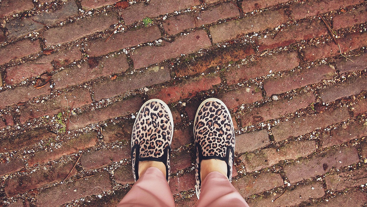
And here’s your ace: treat animal prints like neutrals. Leopard, zebra, snake they’re the wild cards that somehow go with nearly everything. Use them like you would a solid, and you’ll get pattern play without visual overload.
Dos and Don’ts That’ll Save You the Trial and Error
When you’re working with eye catching prints, restraint is your secret weapon. If your patterns are loud, don’t complicate things further keep the silhouette clean and simple. Think straight cuts, classic shapes, zero fluff. Let the prints do the lifting.
Same goes for accessories. Skip the stack of bangles or oversized belts. Prints already command attention. Piling on extras just muddies the message.
That said, layering still matters just be smart about it. Start small: maybe a printed scarf. Then a patterned top. Then pants if you’re ready. Building one piece at a time helps balance the overall look without it spiraling into chaos.
And if something feels a little off? Who cares. Print mixing isn’t math it’s a vibe. A confident misstep can look more stylish than a scared attempt at perfection. Own it, walk tall, and most people won’t notice the rules you bent.
Season Proof Print Pairings to Try
When it comes to mixing prints, timing matters. Not every combo works year round, and the season you’re dressing for can either elevate your look or throw it completely off. So here’s a simple breakdown of what to pair and when.
Spring/Summer: Think light, bright, and full of contrast. Tropical prints bring energy. Paired with playful polka dots, the look reads fresh, not frantic. Or go softer pastel plaid layered with airy florals hits that perfect balance between structured and whimsical. The goal for warmer months: patterns that let your style breathe.
Fall/Winter: Heavier fabrics call for bolder moves. Try the sharp, classic edge of houndstooth against the fluid lines of an abstract print visual tension, done right. For something a bit more earthy, leopard print blends surprisingly well with muted florals, toning down the wild and leveling up the layering.
Year Round Classics: Some pairings are built for any calendar page. Pinstripes and stripes are a natural match just vary the direction or scale to avoid uniform overload. Camo and bold geometrics might sound chaotic, but pulled together in the right color palette, they create an intentional, confident clash that’s hard to ignore.
Use these combos as jumping off points. Then make them yours.
Mixing Prints for Your Body’s Best Look
Prints aren’t just about patterns they’re tools. Use them right, and they’ll work in your favor. Start with size: large prints command attention, which makes them ideal for spotlighting areas you want to highlight. Smaller, more intricate patterns are great for subtly downplaying.
Next, pay attention to print direction. Vertical lines naturally elongate the body, giving you a sleeker look. Diagonal prints are underrated they add movement and can create the illusion of shape where you want it most, whether it’s defining the waist or contouring the legs.
Most importantly, keep your silhouette in mind. It’s your blueprint. You can wear the loudest mix of prints out there, but if the shape doesn’t work for your body, the look falls flat. Stick to your most flattering cuts and let the prints do the rest.
Want to go deeper into styling with shape in mind? Check out A Guide to Dressing For Your Body Type With Confidence.
Fast Track to Pro Status
Start small. Accessories are the training ground for mastering print mixing. Grab a leopard print bag, floral sneakers, or a paisley headscarf. They’re low risk but high impact perfect for testing combinations without committing to a full outfit.
Next, lean into Pinterest. Don’t just scroll search intentionally. Find looks you love, save them, and then raid your own closet to recreate the vibe. Exact replicas aren’t the goal. The idea is to audit what you already have and learn how to put it together with fresh eyes.
One last step: take photos. Every outfit. Full length in natural light. This isn’t just for vanity it’s your feedback loop. Seeing your combos through the camera lens trains your eye and builds precision. Patterns that feel risky in theory often just work when you look at them in the frame. Over time, confidence builds quietly in the background.
Where Style Meets Personality
Mixing prints in 2026 isn’t just about chasing trend waves it’s about telling your story without saying a word. Patterns speak. They clash, they complement, and most importantly, they reflect who you are. Whether you’re pairing paisley with python or stripes with vintage florals, the goal isn’t to match it’s to express.
But here’s the thing: bold doesn’t mean random. This is strategy, not chaos. Build your combos with intention. A wild print can dominate, so let the others support it. Think of your outfit like a band you don’t need every piece screaming lead vocals.
The style rulebook hasn’t been thrown out; it’s just evolved. Knowing the basics makes it easier to rebel with purpose. That’s what separates a walking collage from a look that stops traffic. Master the rules, then break them like you meant to.